The Project
Rebrand of the "Stepping Stone" tile company. The business has been on the market since 2017 and so it already has made its logo design, website and products. The main problem this company has been facing is an outdated look that has only been attracting customers that are mostly over the age of 45 years. I've been requested to design a new business logo while showing couple of usage examples while keeping the company's colour palette that is mainly including a bright orange, to help them attract a younger audience and rise up their sales number.
The Goal
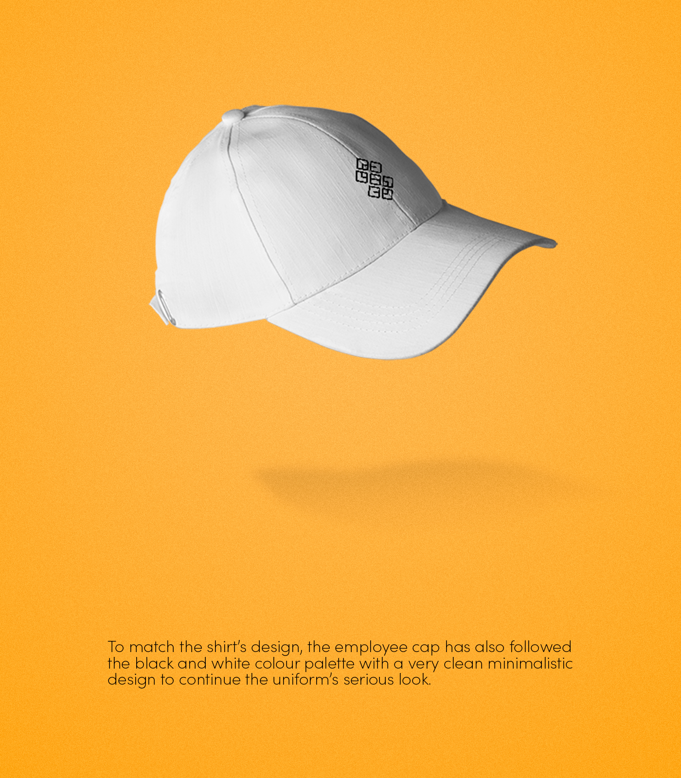
To be able to successfully aim and hit the target goal, firstly the target needs to be broken down and be clearly viewed. To achieve the attraction of the younger generation, the logo design should be fitting in today's modern society's standards while still standing out from the average tile company. Later on equip the company with its essential parts that will also be designed under the same mindset of the modern look, such as the business card and employee uniform.

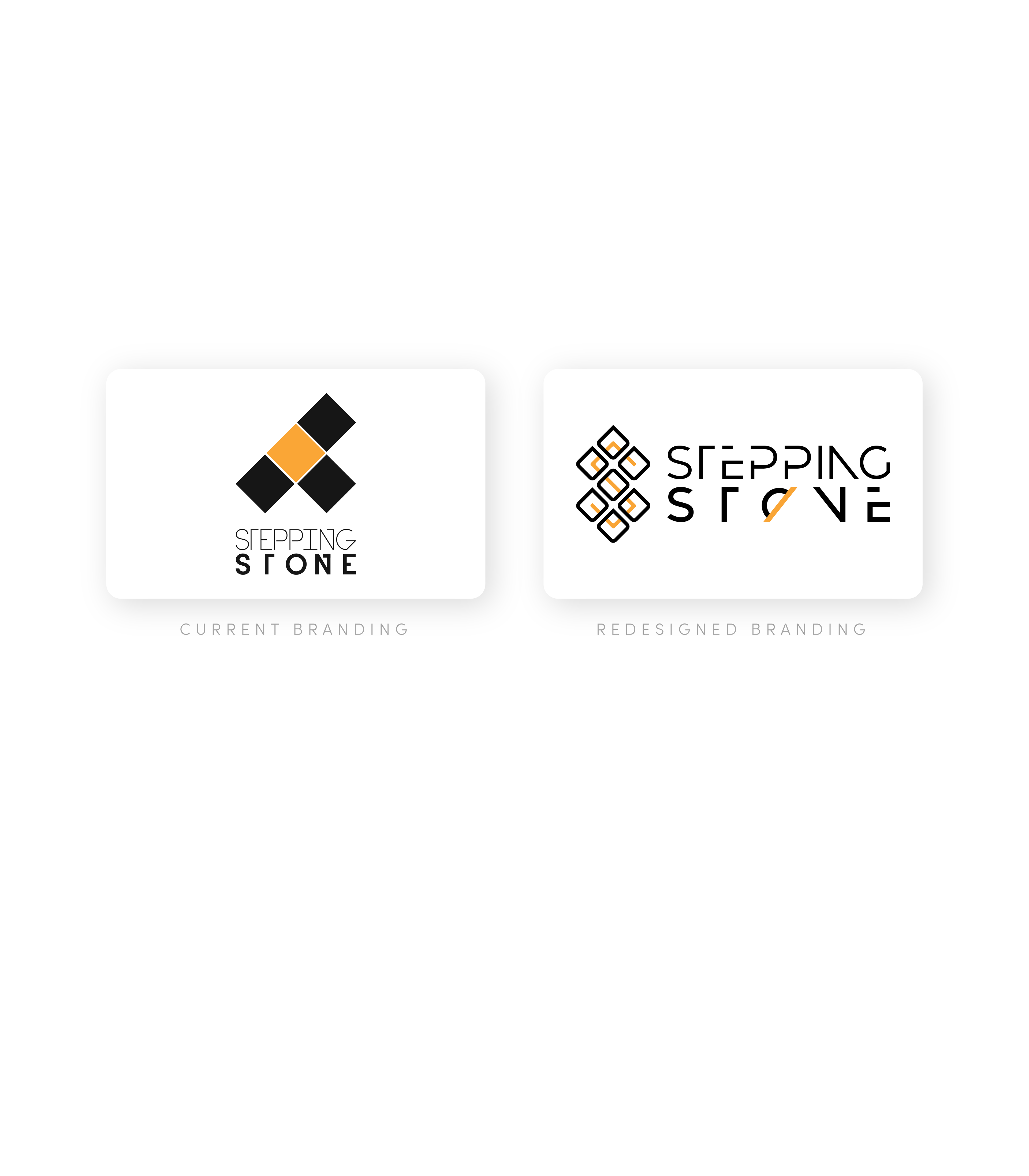
LOGO REDESIGN
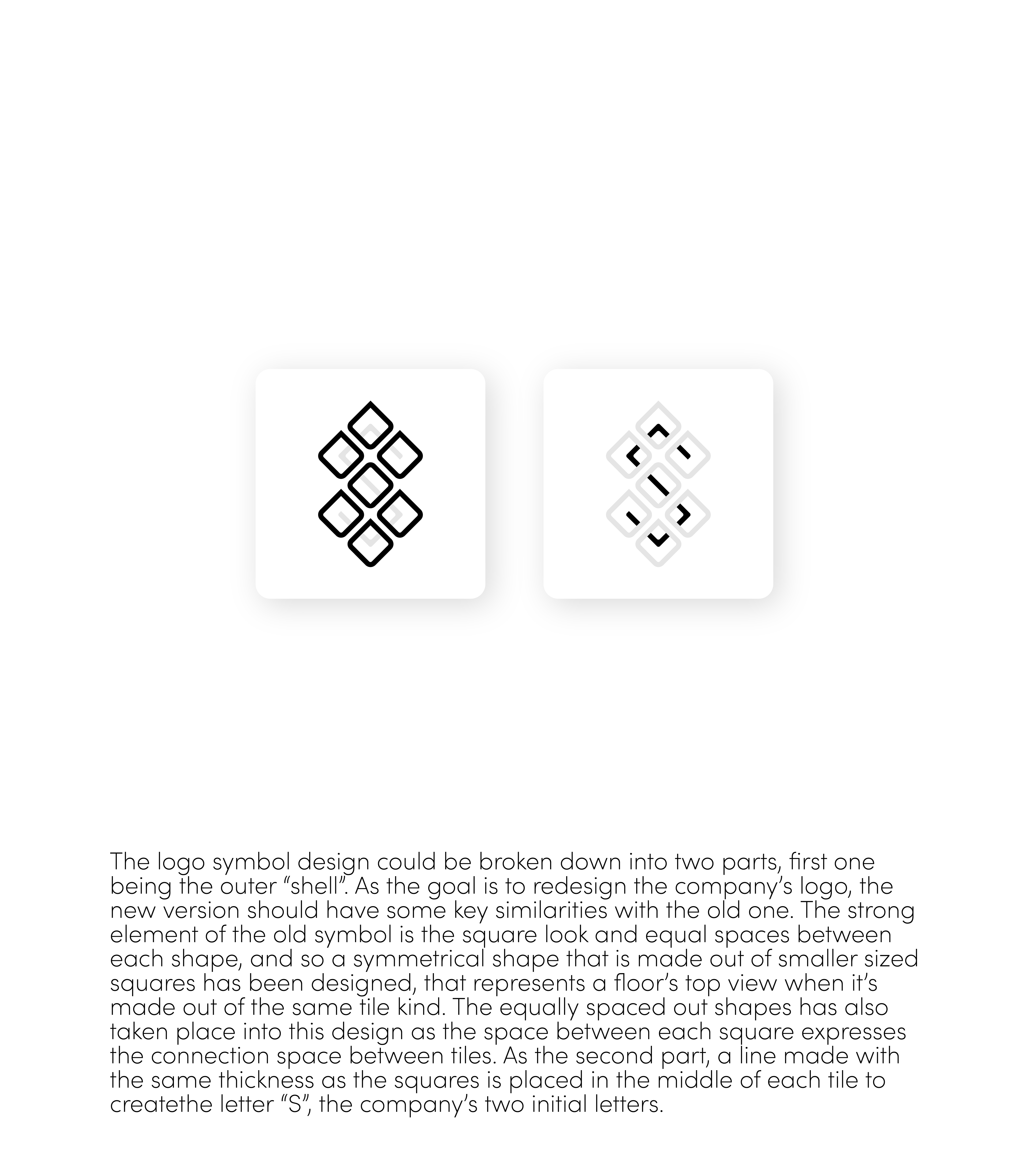
SYMBOL DESIGN
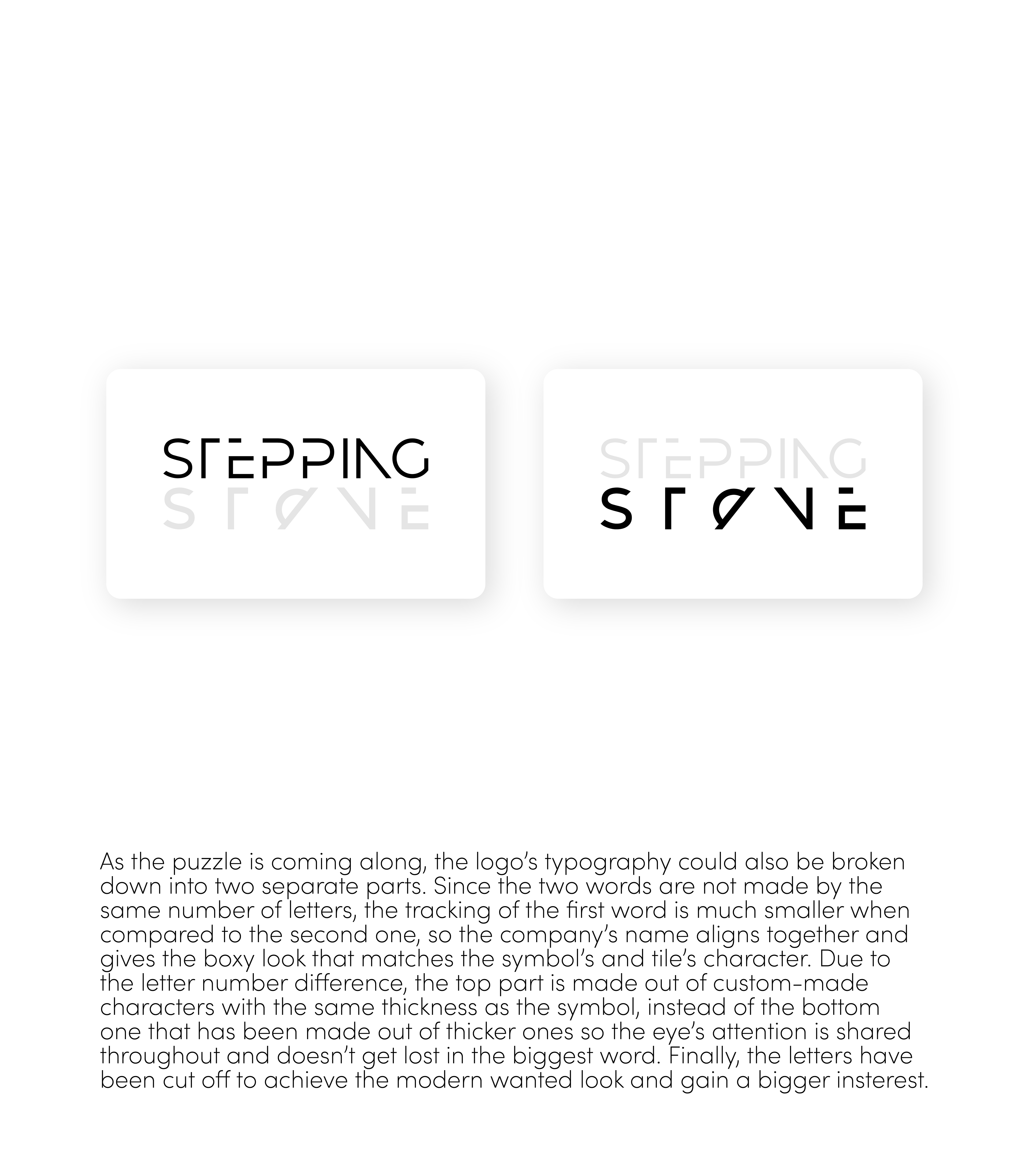
TYPOGRAPHY DESIGN
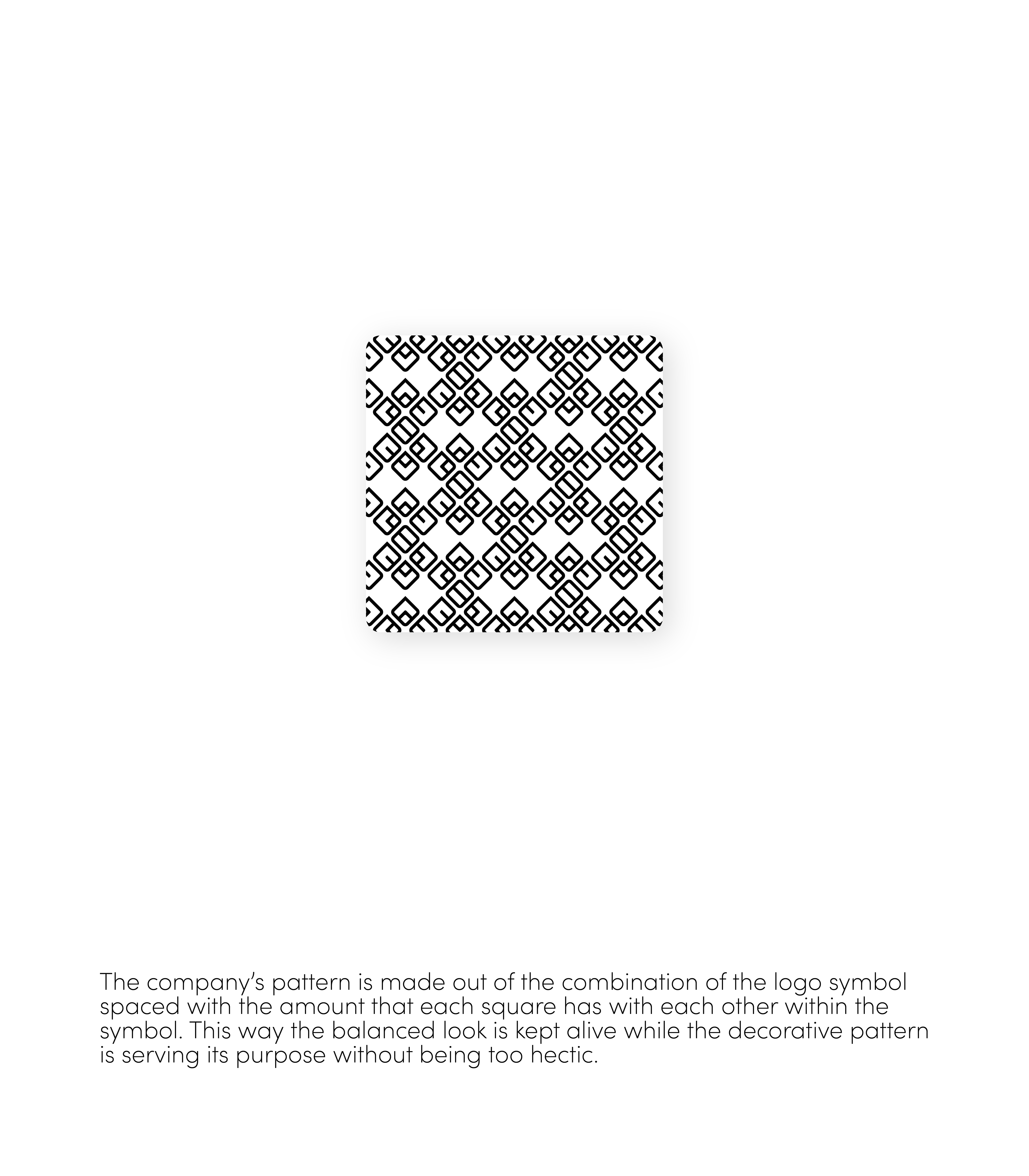
PATTERN DESIGN
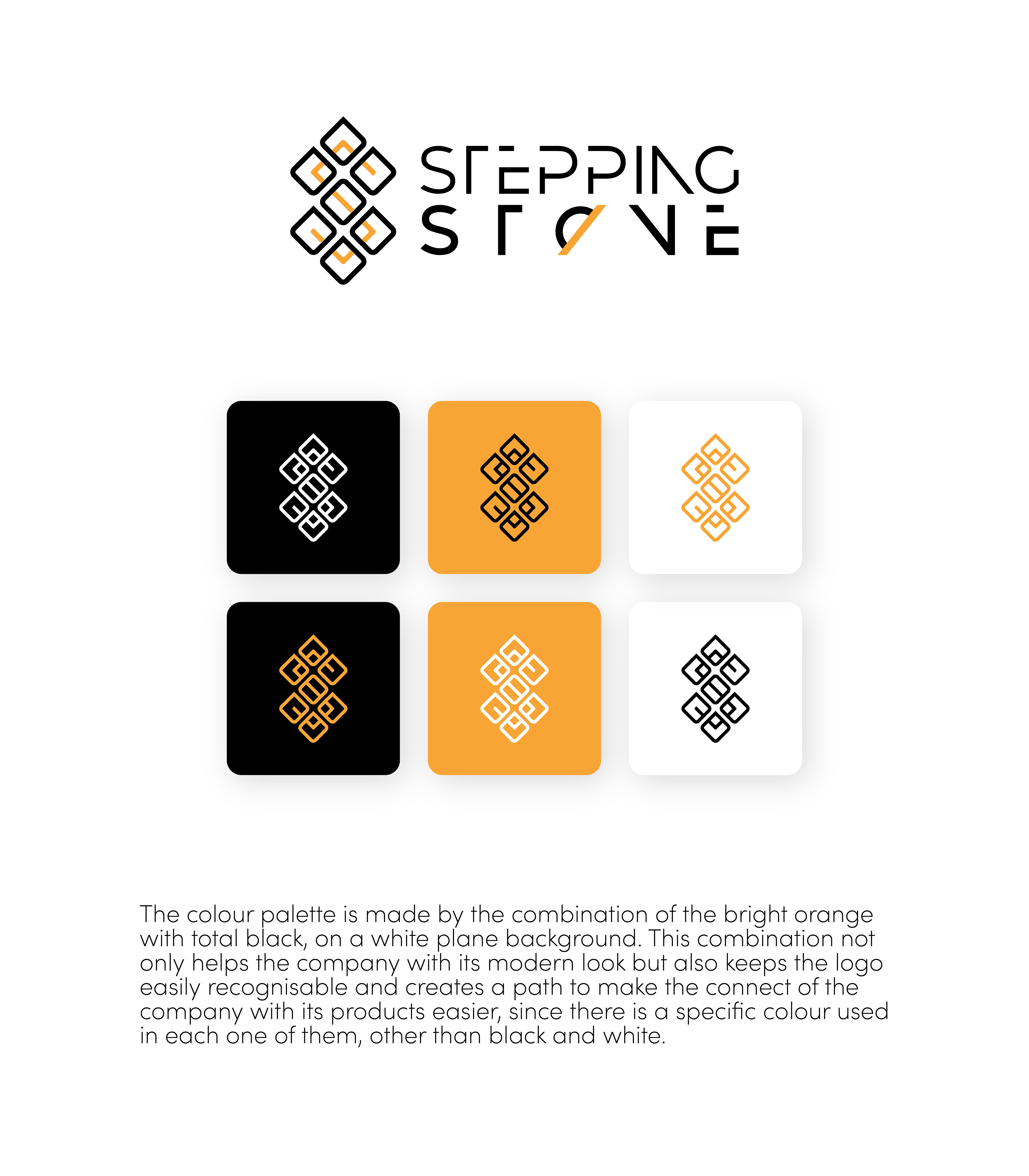
COLOUR PALETTE

SYMBOL

LOGO
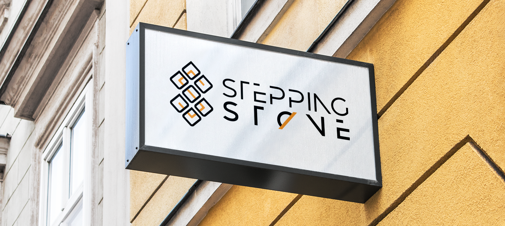
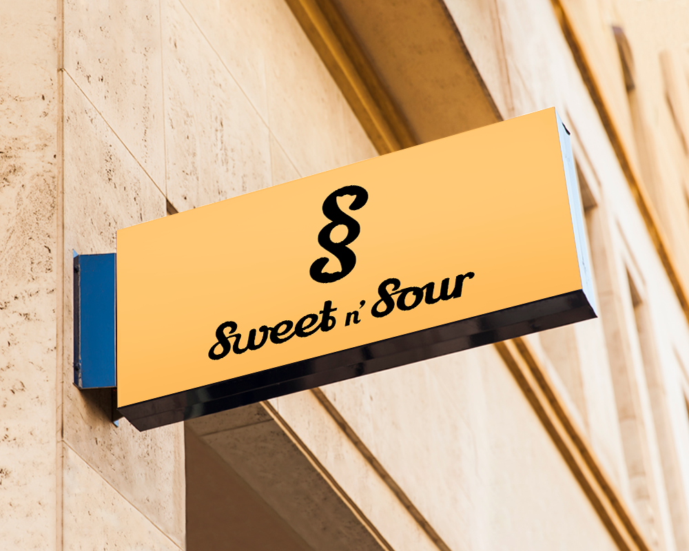
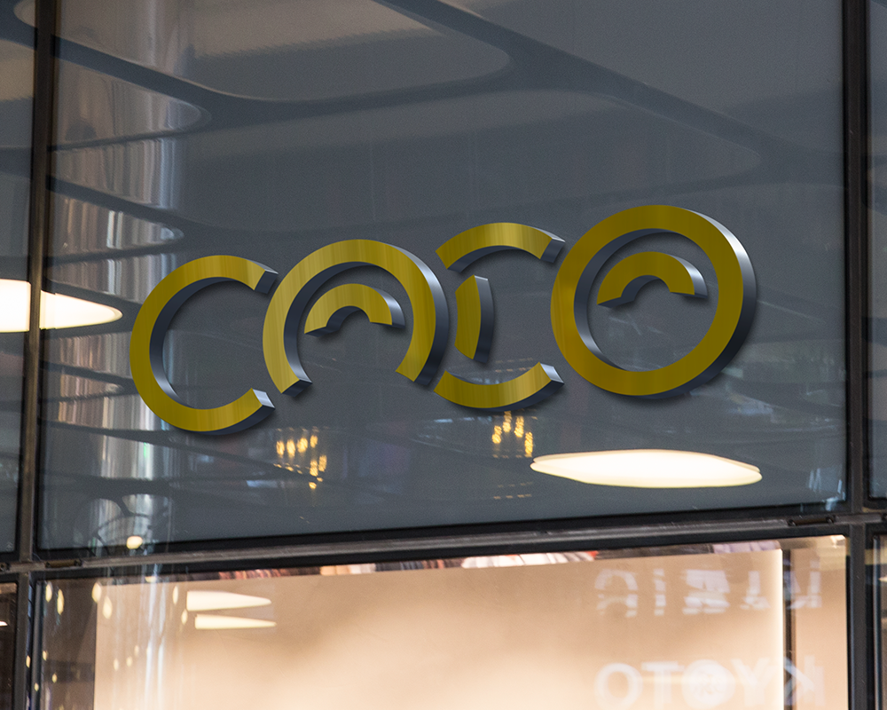
STORE SIGN
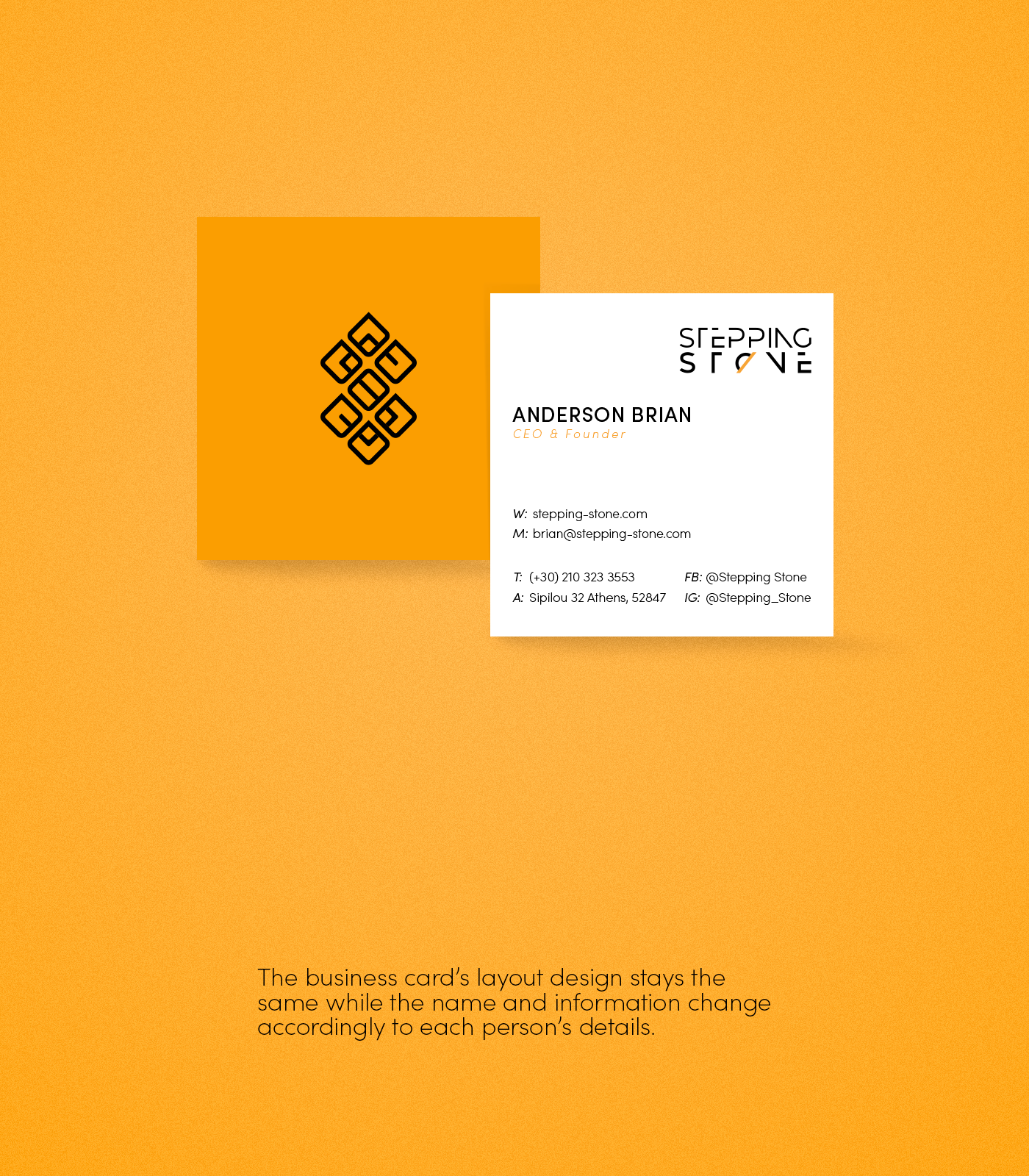
BUSINESS CARD

BUSINESS STAMP
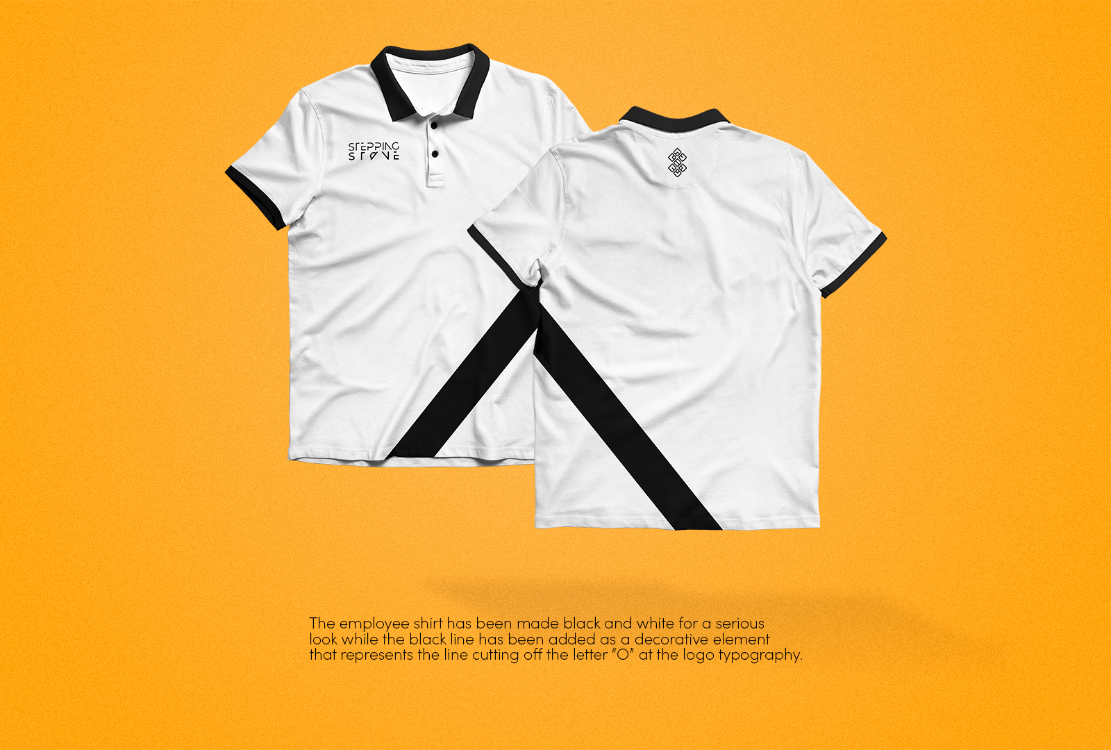
EMPLOYEE SHIRT
